

logo usage
Porkbun communications should feature the Porkbun logo proudly and prominently. Because this is the focal point of our communications, and the most recognizable element in our branding, it is imperative that the logo meets all the restrictions and usage guidelines set forth here.
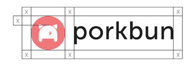
Safety Area
The minimum safety area is calculated by the space X as show above, surrounding the logotype. This will allow enough space around the logo and avoid overcrowding, and keep the clean integrity of the logo in tact. The logo should never be placed on top of a busy pattern background.
Minimum Size 0.25” height
The smallest size of the logo should be a quarter inch in height, in order to preserve legibility.
Color Versions
Alternative versions of the logo include a rich black version, a reversed version, and several one color options in either porkbun pink or rich gray. Use these versions when printing in one color, or when your brand colors could compete with the Porkbun full color version.
Brand Guidelines
A download-able one-page PDF has been made available to download here with all the relevant information pertaining to the Porkbun brand.


Version 2.0 — 06.2018
If you are having trouble with anything in this guide, have any further questions or would like to request additional assets. Please contact the Porkbun design team at support@porkbun.com.